Overview
The Single Source for ETF Intelligence
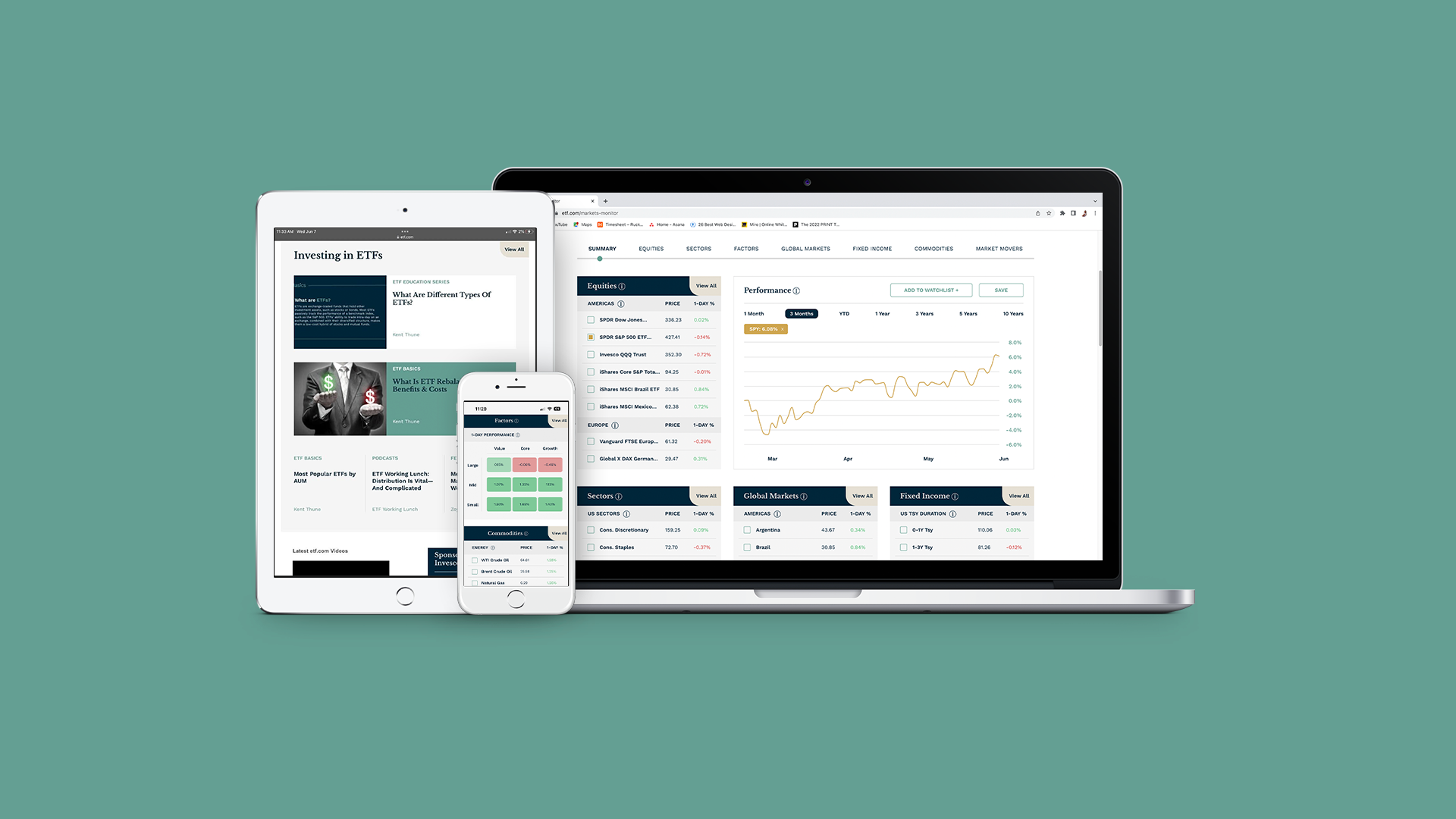
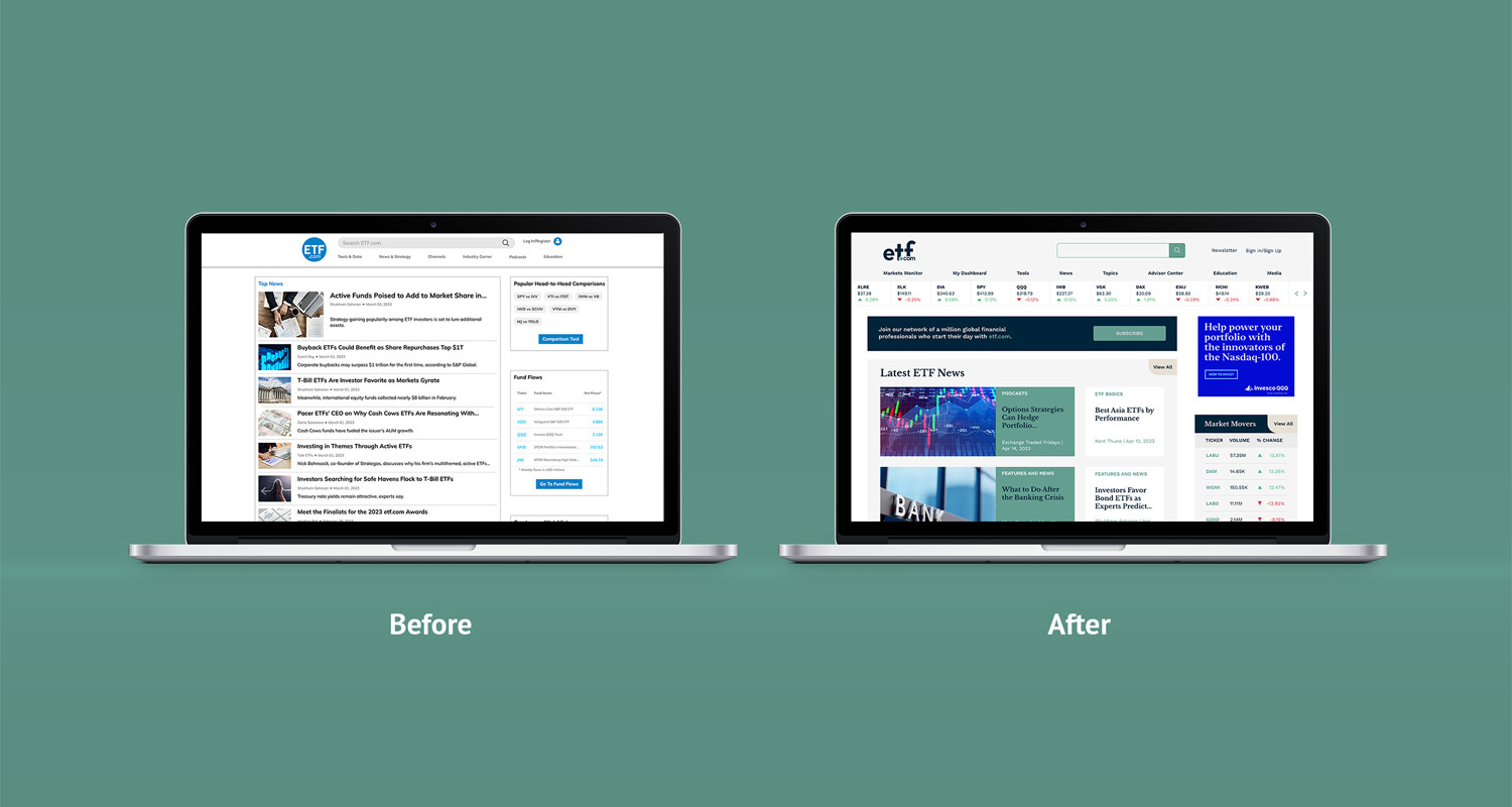
etf.com was an ing brand with an online platform designed over a decade ago. As a result, its brand schematics and “blog” style information architecture were outdated and in need of a complete redesign. Ruckus immediately went to work turning etf.com into a financial portal fit for both financial experts and newcomers alike.
Mission
Ringing etf.com's Opening Bell
Ruckus was tasked with re-branding and designing a complex platform to communicate complex financial information effectively.
Result
A Fresh Look
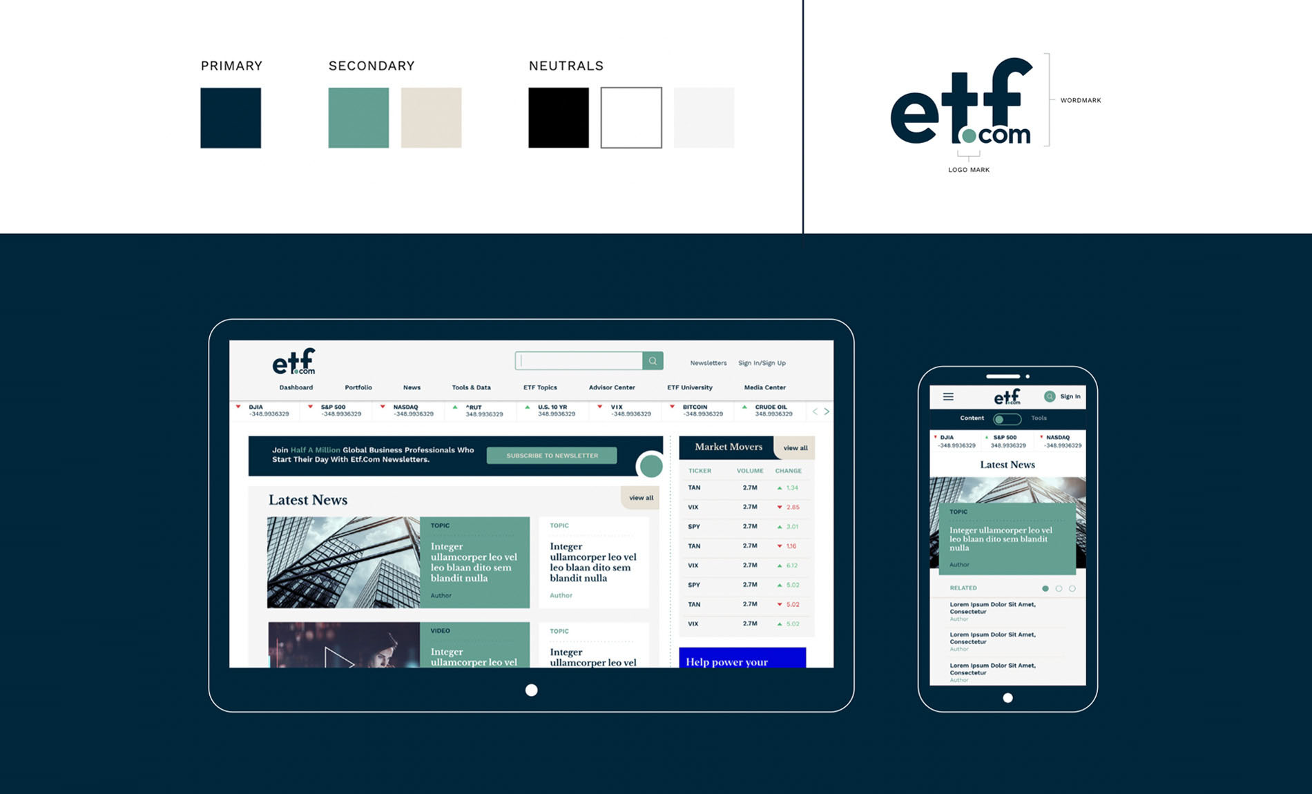
Inspired by newsprint and financial periodicals, etf.com’s redesign centers around the idea of bridging the gap between traditional finance and emerging tech. In keeping with the newspaper theme, serif typography is utilized for headers and distinct green overlay (similar to that used in US currency) is used to draw users to specific information.
Result
Content-Driven UX
Content is delivered to users based on the preferences in their profile via a funnel approach. Users are able to favorite contributors and topics, which triggers daily email updates based on preferences. etf.com is also smart, meaning related content will be dynamically shown to the user that when in a specific section of the site.
Result
Native Monetization
By understanding etf.com’s architecture, we were able to identify where and when to create monetization opportunities by creating spaces for ads in areas of the site that received proportionately more traffic than others.
Result
Mobile-First Design
Responsive optimization was paramount to the platform design given the nature of how the site is used by its audience. Each tool and experience throughout etf.com was designed with mobile in mind, utilizing best practices to ensure the information was delivered in a fast and streamlined manner to the user in a responsive environment.

Result
Industry-Standard Tools
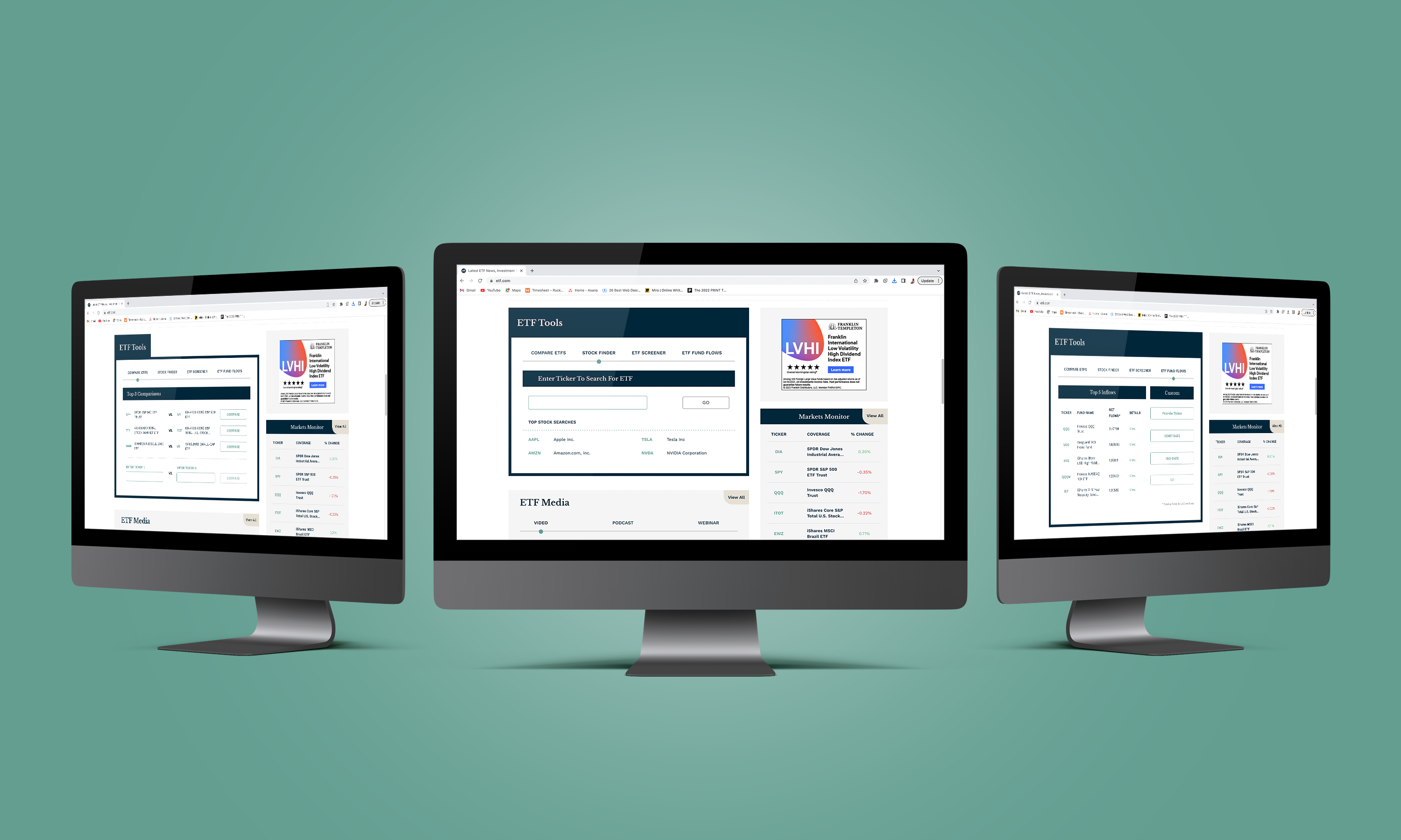
Ruckus designed a series of tools that are industry standard, never before seen on etf.com
- Homepage Ticker Crawl: Allows users to see the biggest daily market movers at-a-glance.
- ETF Screener: Allows users segment ETFs by filter and parameters. Information populates a table where users can compare things like Fund Basics, Performance, Fund Flows, Analysis, Fundamentals, ESG Data or create a Custom Table.
- ETF Fund Flows: This tool allows users to input a Ticker, Start Date and End Date in order to see daily fund flows for that ticker.
- Compare ETFs: This tool allows a user to select 2 tickers and compare them against a series of variables. The tool also generates chats and data for review.
- Stock Finder: This tool allows users to search a stock ticker and see all the ETFs that carry that stock.
Services
Rebrand & Web Design
Branding · Copywriting · UX Design · Custom Web Tool Design
